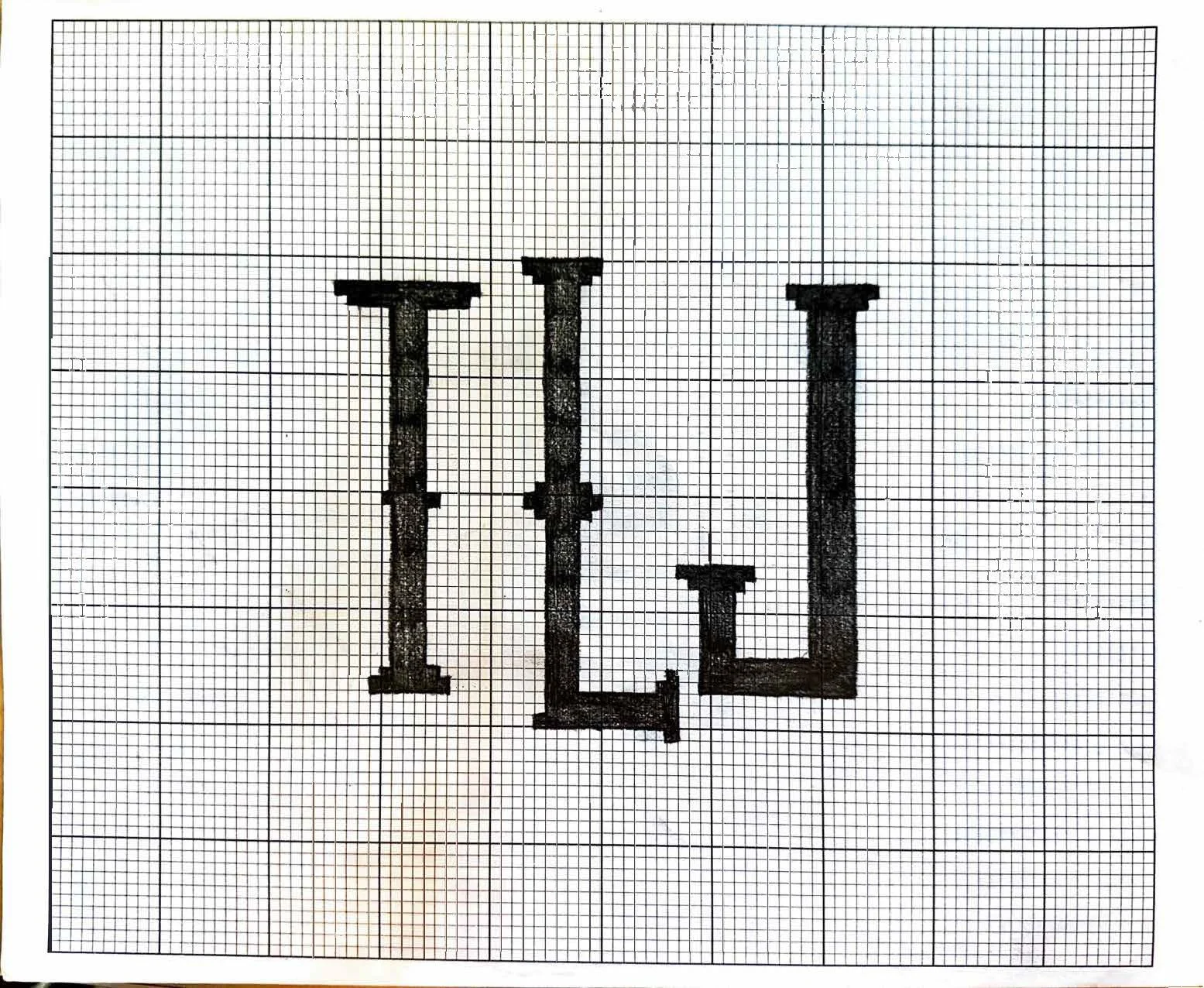
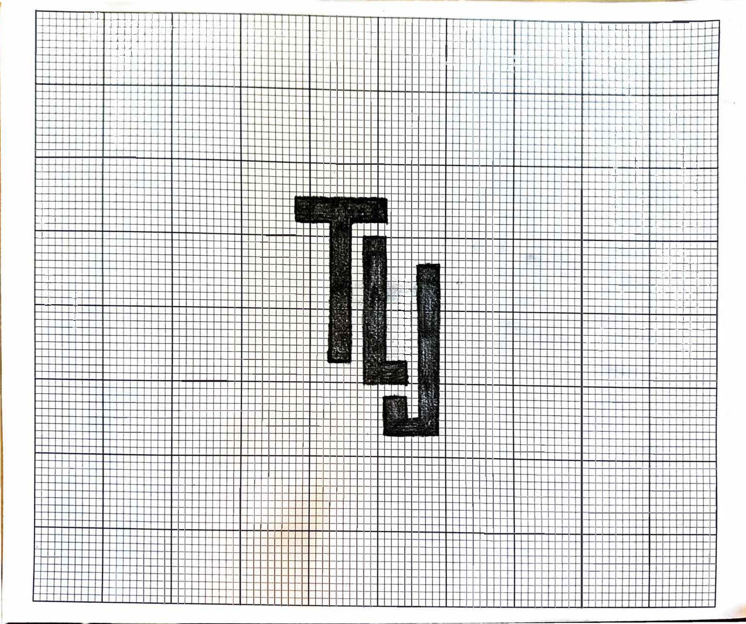
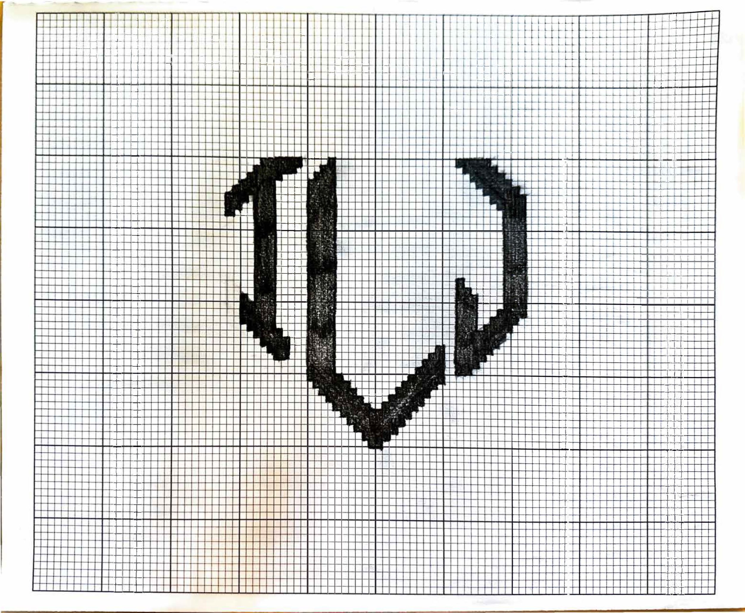
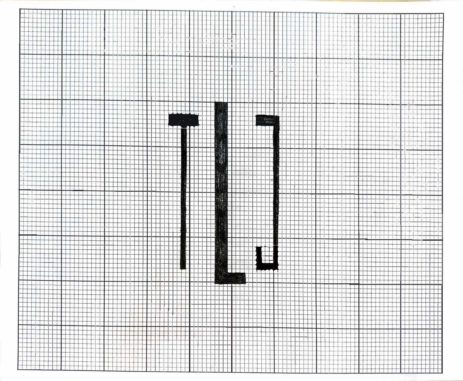
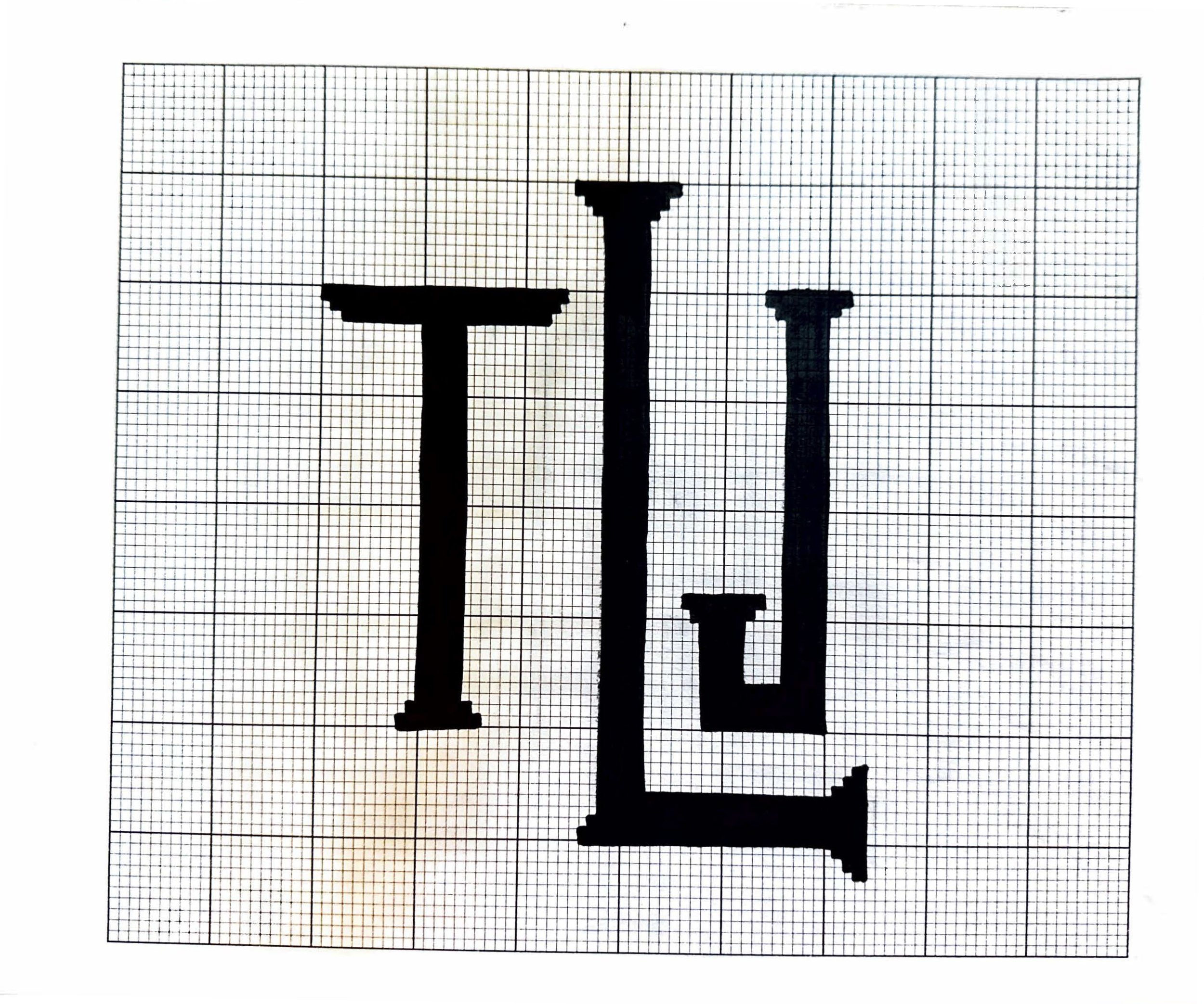
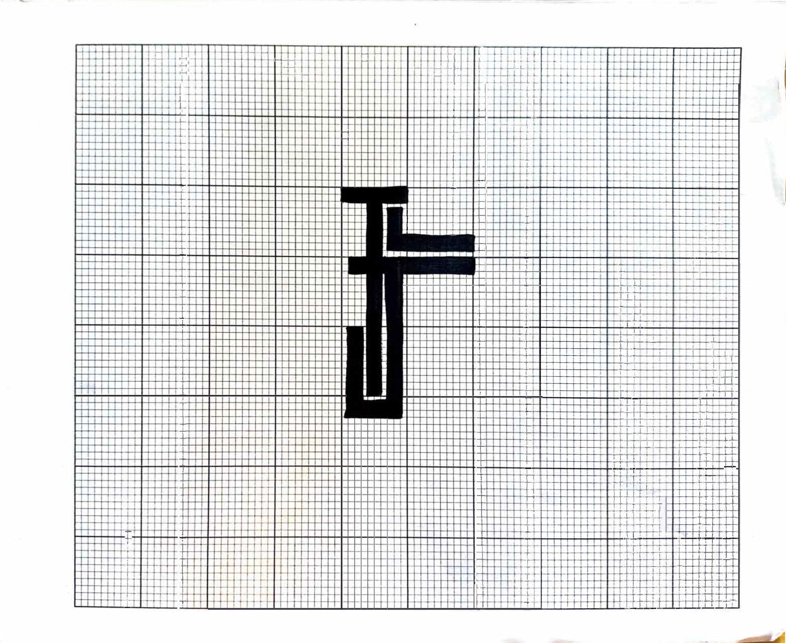
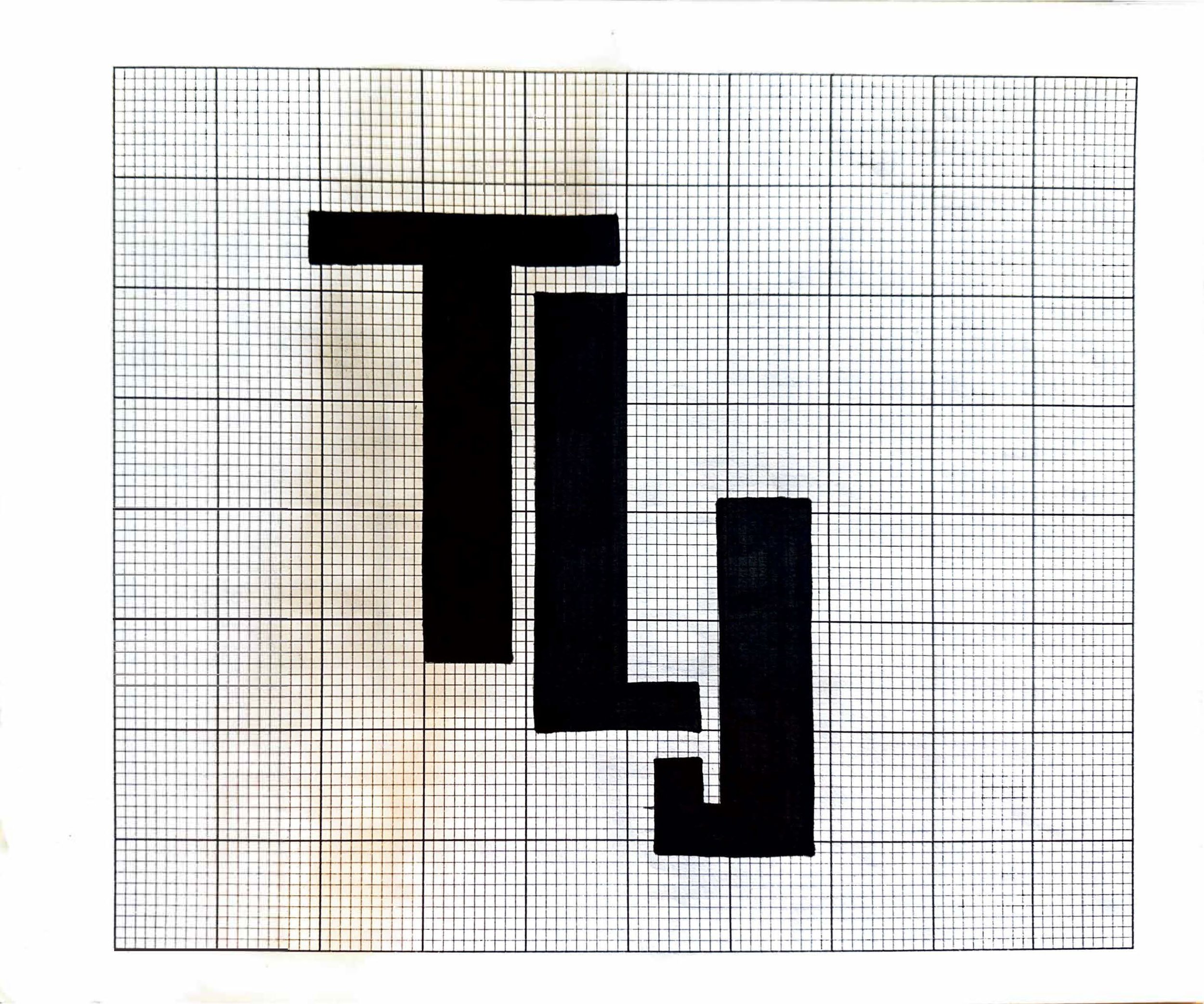
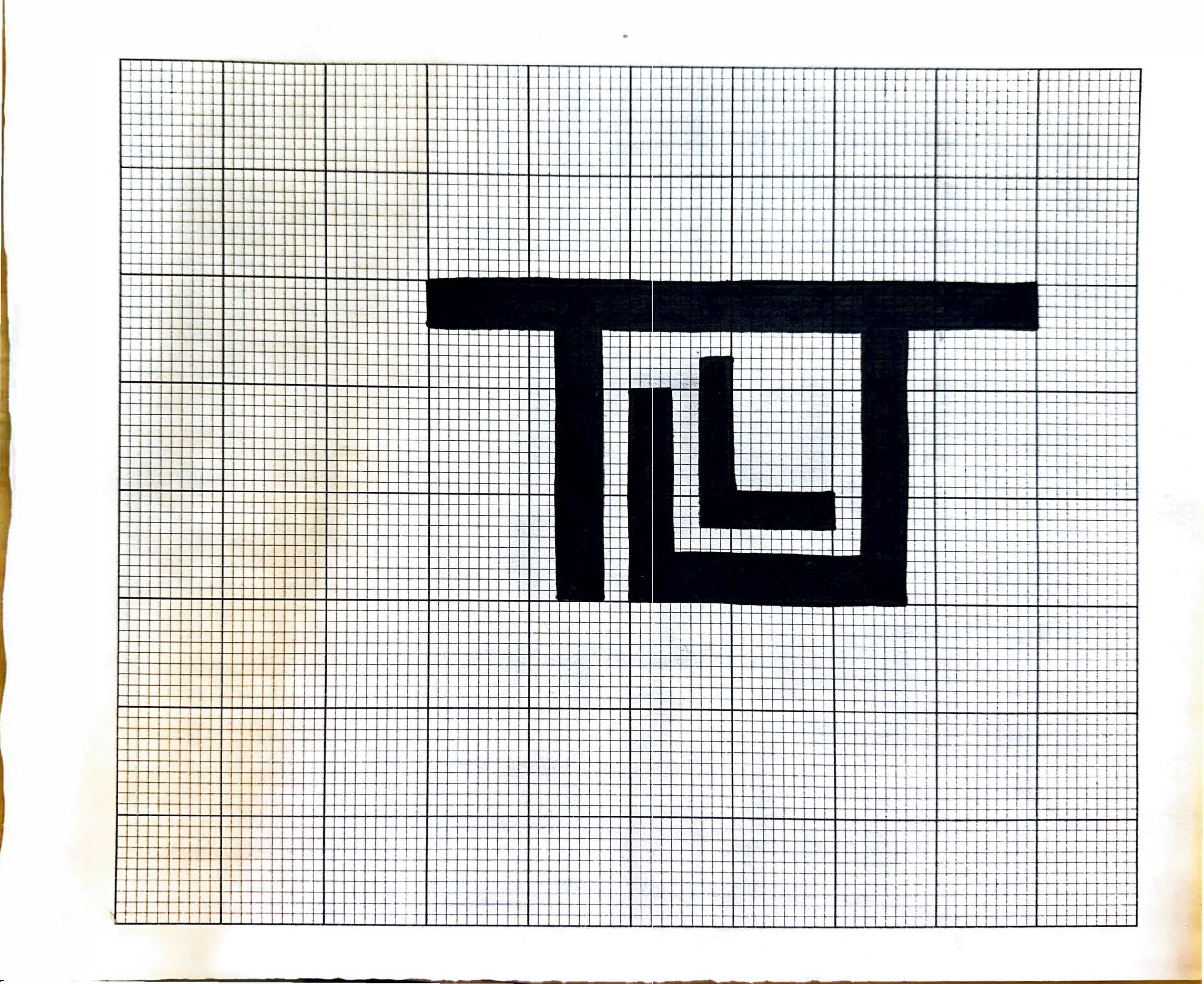
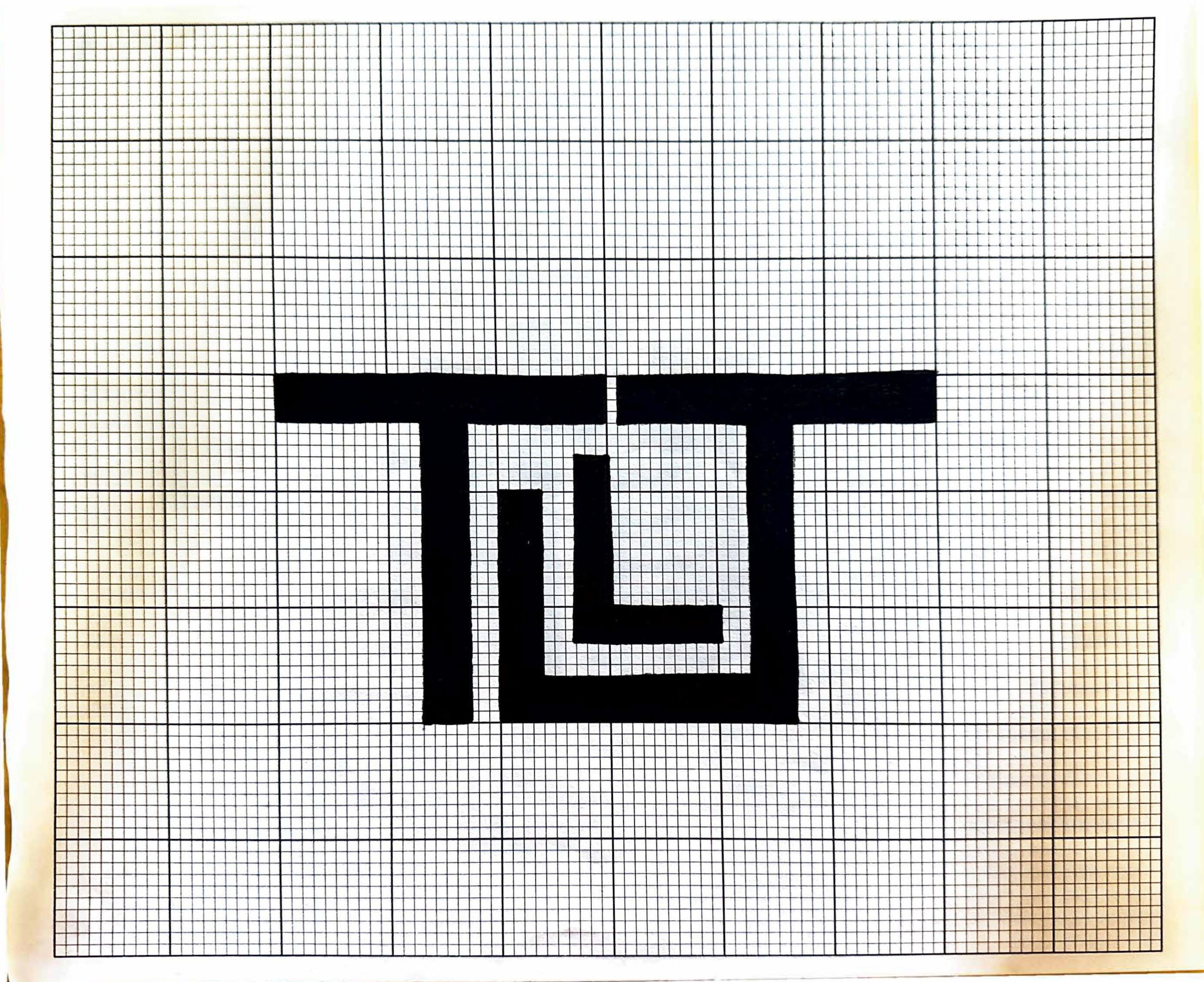
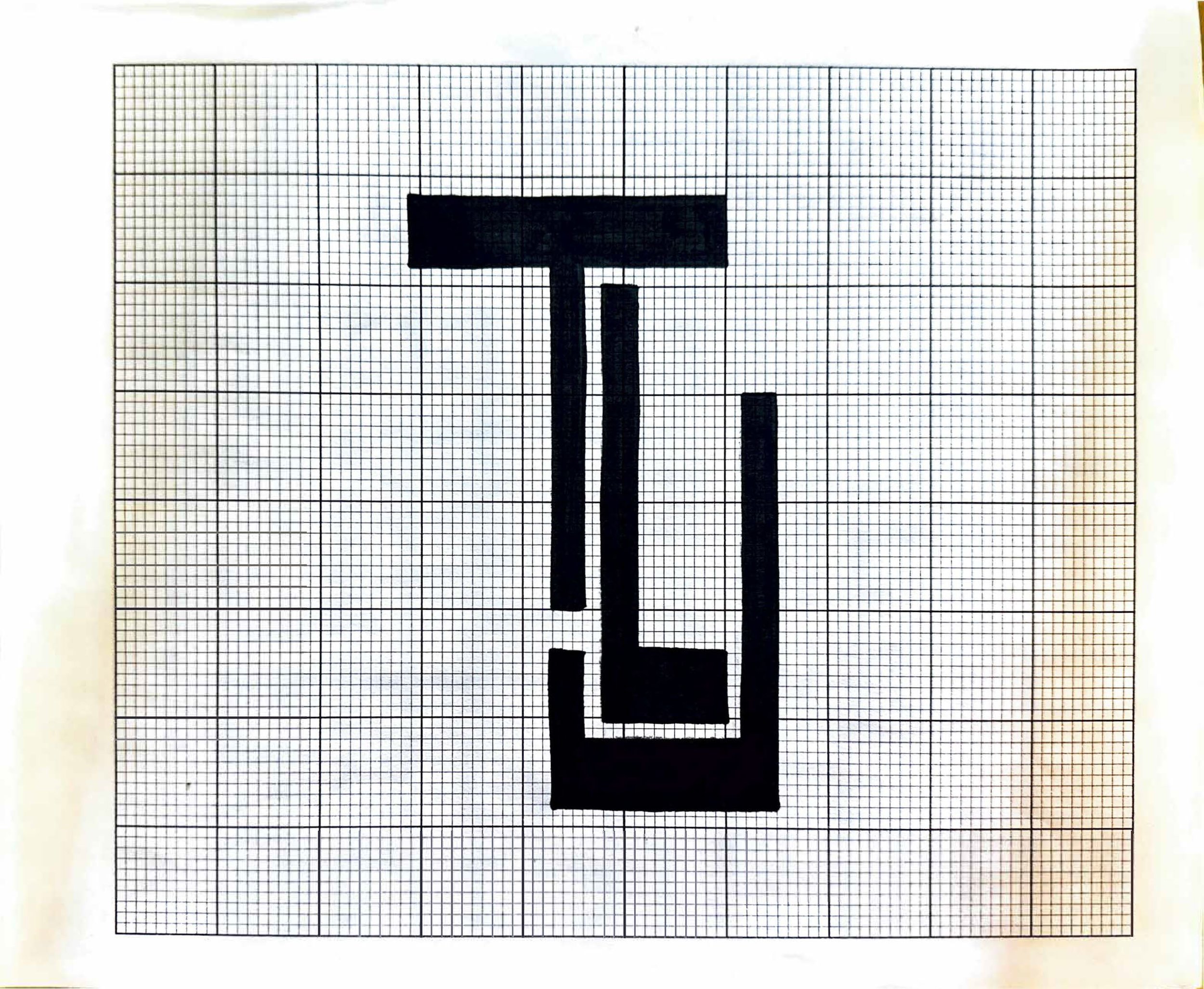
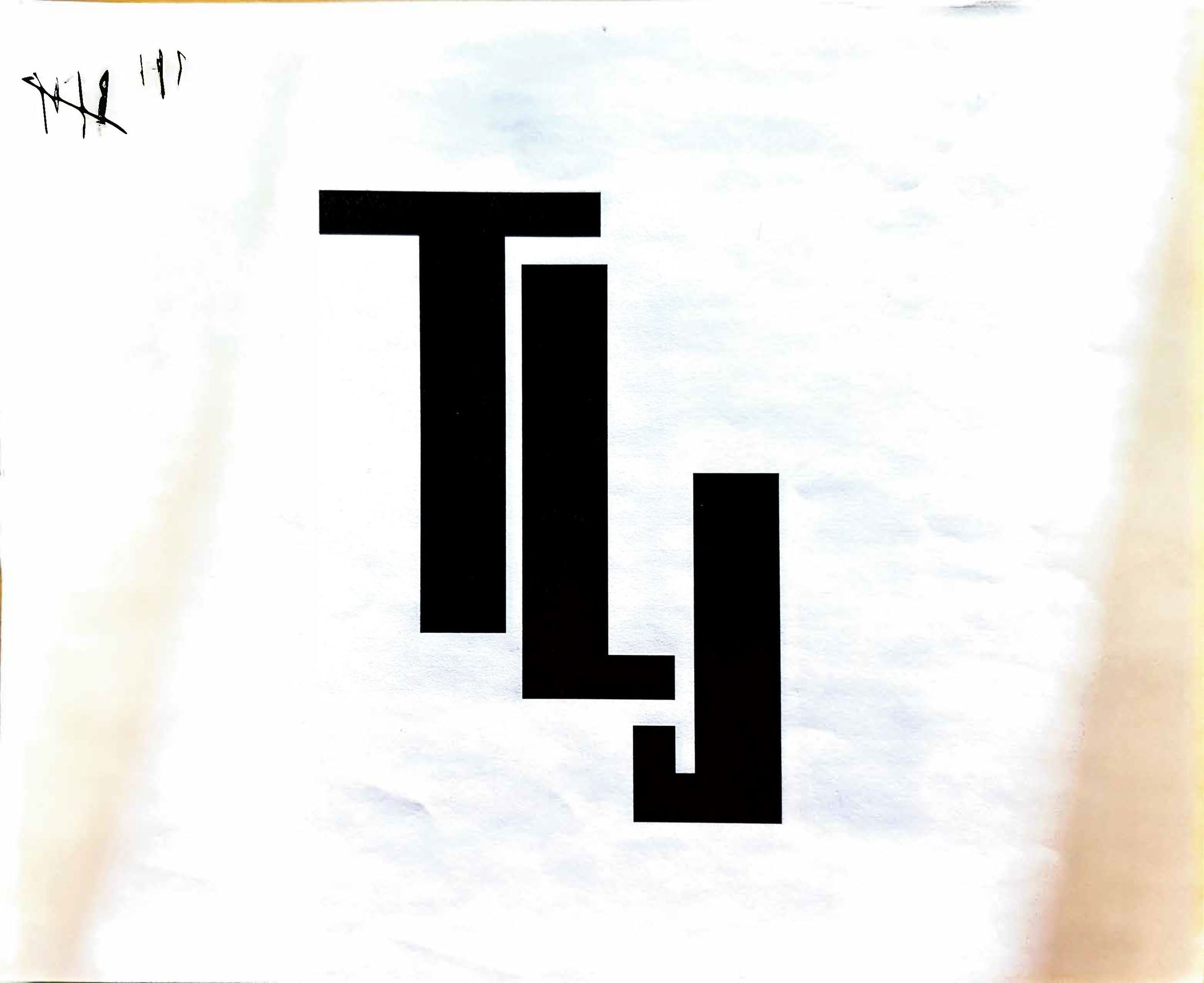
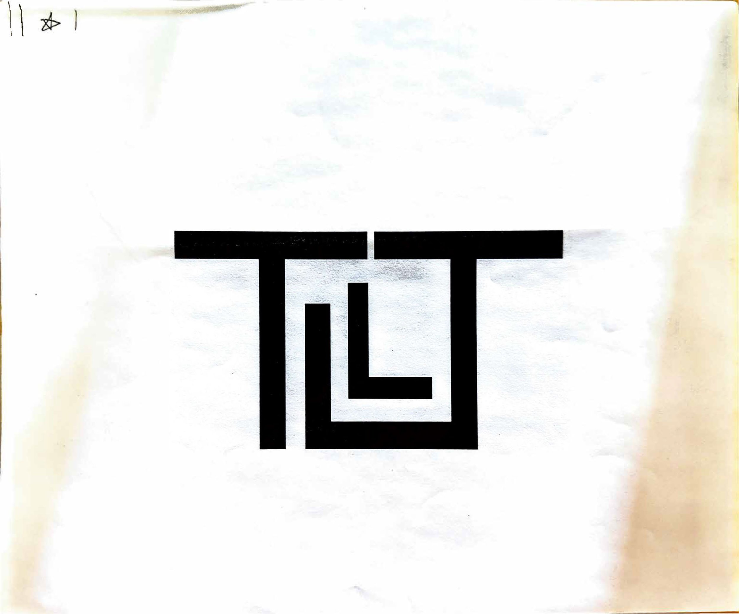
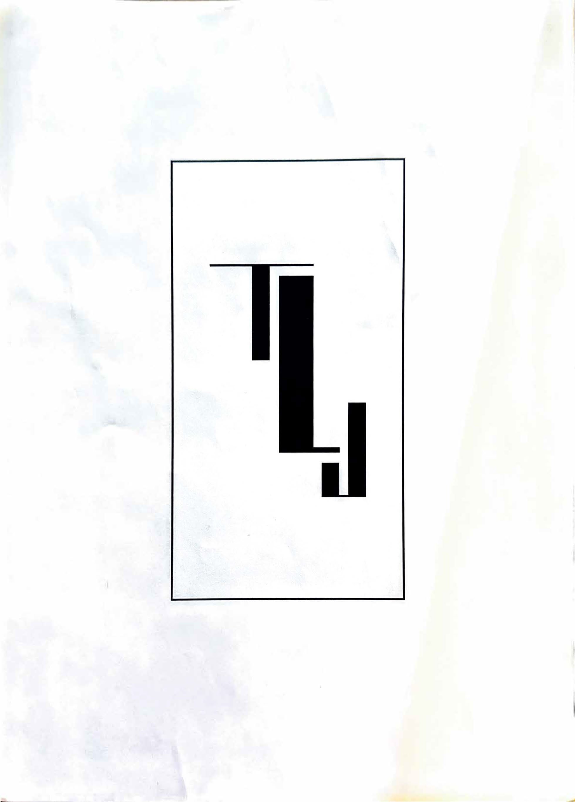
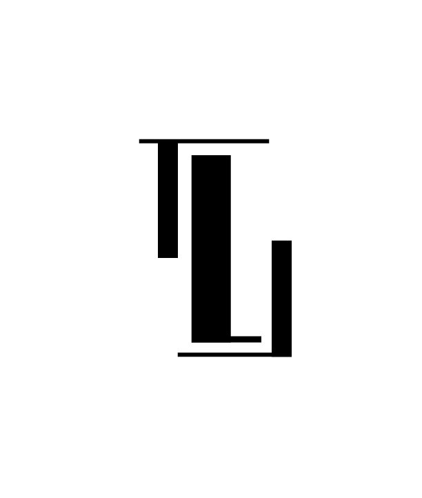
Bitmap Monogram

The bitmap monogram project encouraged me to experiment with typeface design and translate sketches into digitized designs. For this project, I focused a majority of my design attention towards the interaction of each letterform with one another. In creating my initial design, I felt drawn to the traditional monogram style that includes a larger middle initial because of the professional and clean look it brings. In the revision stage of this assignment I referred back to my original sketches and rediscovered a layout that I pursued with this final design. This design is more cohesive and visually interesting than my original. The use of simple strokes and consistent margins throughout this design creates a cohesive, unique monogram.