Menu Design

The menu design project deepened my understanding of type hierarchy through size, placement, and alignment. These two final menu designs use two different styles and strong grids throughout. The use of boxes and strokes to create sections allows for strong organization of the content I was given. The two contrasting designs—one being more cozy, cafe-like and the other more modern and sleek—emphasize my diverse set of skills and adaptability. The small scale of the company’s logo places an emphasis on typography and balances the white space of this design.
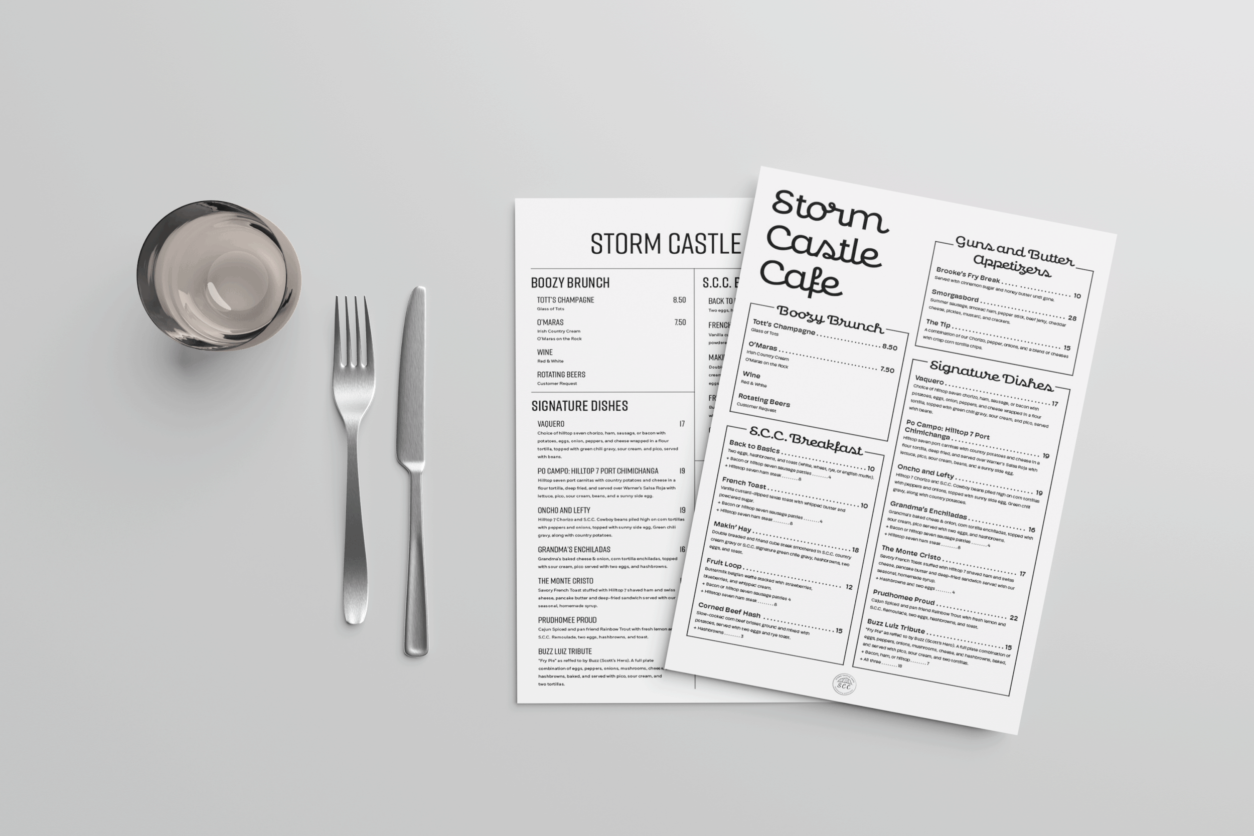
Additional Mockup
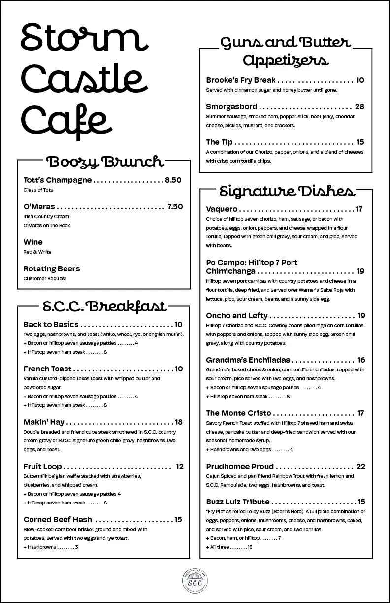
Menu 1
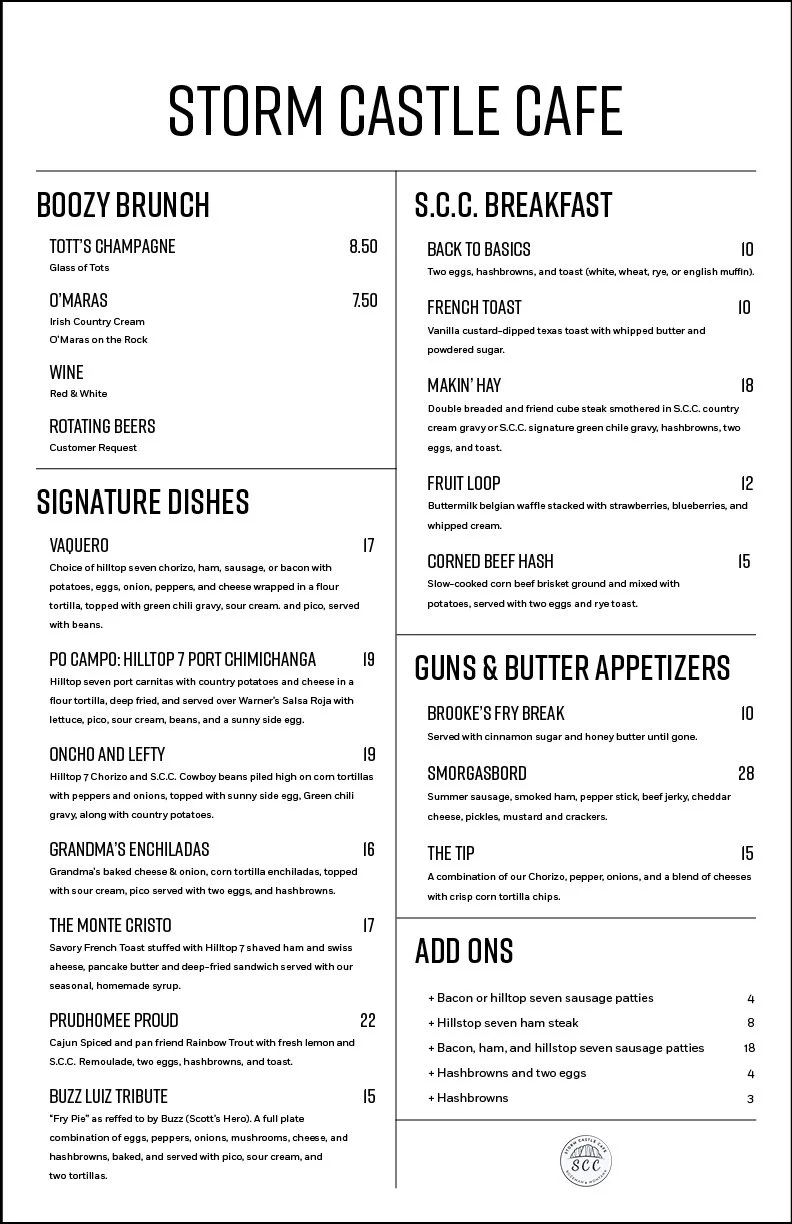
Menu 2

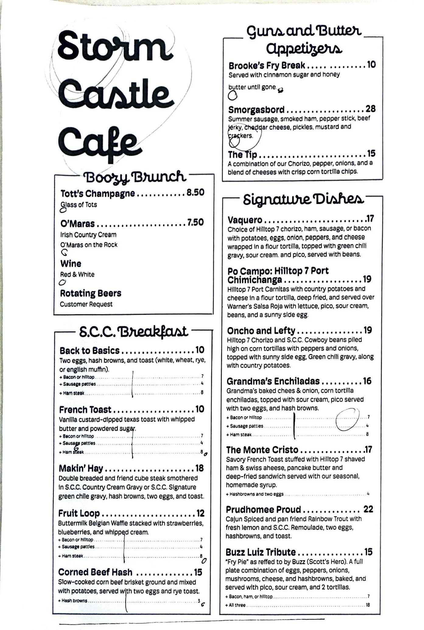
In-Progress Designs
Menu Audit

Typeface Ideations